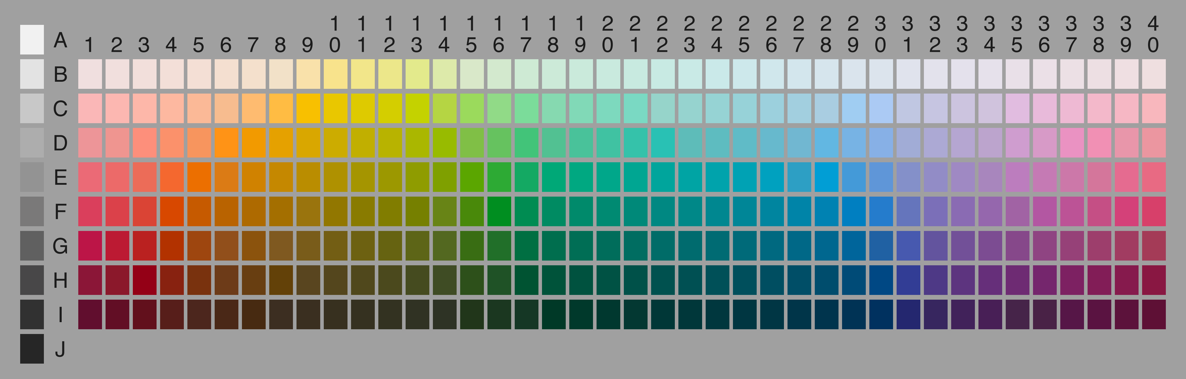
The World Color Survey by Kay, Berlin, Maffi, Merrifield and Cook is a publicly available dataset of cross-langauge color semantics. The dataset contains both names for the colors of the Munsell chart (above) as given by 2618 speakers of 110 languages, and for each of the 2300 elicited terms also a pick of focal color for each of the terms.
In order to make the data more accessible, we have created a few visualization tools for navigating and exploring the dataset. Our visualizations focus primarily on the elicited color names, not on the focal color picks. We have also constructed, using Google Maps engine, a geo-informatics visualization of the languages included in the dataset.
Mapper analysis of WCS data. Among the 2300 color terms listed in the data set, there are 84 that do not occur as elicited colors at any point, and 731 that are only used by 1 speaker. Additionally, there are 79 colors that do not show up with any responses in the aggregated data. All in all, the dataset retains 1441 unique color terms once all these low-use color terms are removed. For these 1441 we have computed an Earth Mover's Distance to accurately reflect perceptive distances between colors, and we make the results available for exploration using Mapper for visualization.
Mapper proceeds very similarly to clustering methods, but provides more insight into the underlying connectivity structures: data that does not form natural clusters will often have a shape more easily discovered using Mapper. It may be helpful for using the tool to read through our documentation.
WCS data visualization For a more exploratory approach to the data, we have also produced a simple tool for looking into the data. The display shows all languages, with speaker counts; all lexemes, with response counts; language details, and when hovering over the Munsell chart at the top, response rates for lexemes that were given to identify a particular cell are displayed.
These visualizations are a joint project between Mikael Vejdemo-Johansson, KTH Royal Institute of Technology and Susanne Vejdemo, Stockholm University. The tools were written using d3.js for visualization, and a not yet publicly released Mapper by Aravind and Daniel.
Mapper was developed by Gurjeet Singh at Stanford, and has been used
for knowledge discovery in bioinformatics.
Singh, Mémoli, Carlsson: Topological Methods for the Analysis of High Dimensional
Data Sets and 3D Object Recognition, Eurographics Symposium on
Point-Based Graphics, 2007
Lum, Singh, Lehman, Ishkanov, Vejdemo-Johansson, Alagappan, Carlsson,
Carlsson: Extracting insights from the shape of complex data using
topology, Scientific reports (3) 2013
Ayasdi Inc. is selling data analysis
services based on this approach.
Berlin, Kay. Basic Color Terms: Their Universality and
Evolution. Berkeley and Los Angeles. University of California Press,
1969.
Kay, Berlin, Maffi, Merrifield, Cook. The World Color Survey. Stanford: CSLI, July 2009 (ISBN (Cloth): 9781575864150)